
Color communicates different things to different cultures. What are your colors saying about your brand?
The symbolism of color varies significantly from culture to culture. Businesses use color psychology every day to communicate targeted messages to their customers and to inspire emotional appeals.
But how do colors relate to localization?
Colors Across Cultures (Infographic)
Below is a chart to help you understand the different color perceptions across different areas of the world.
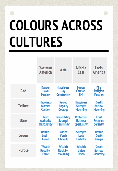
Here are 20 specific examples of local perceptions of color and how they relate to business branding.
Blue
Financial Institutions
In Western cultures, blue is perceived as a sensible, stable, and dependable color, which is why it dominates the financial sector, as can be seen in the true-blue branding and websites of Barclays, Deutsche Bank, Visa, and RBS.
In Eastern cultures, however, especially where Hinduism is practiced, blue suggests immortality.
Pepsi
In the 1950s, Pepsi switched the color of their Pepsi Cola vending machines in Southeast Asia from dark blue to what they believed to be a refreshing, thirst-quenching, icy blue. In that part of the world, however, light blue is the color of death and sorrow. A rapid fall in the company’s share price in the region soon alerted them to the error.

Skin Care
Nivea, the German-based skin-care brand, is so protective of the shade of blue the company has been using since 1924 that they trademarked it.
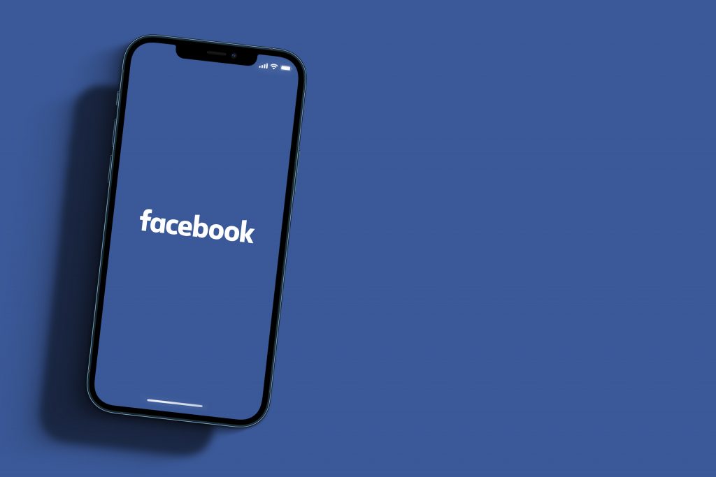
Facebook’s distinctive shade of blue may be an attempt to project a solid, dependable image. Or, it may be because it’s one of the few colors that color-blind Facebook founder Mark Zuckerberg can see correctly, as he explained in an interview with The New Yorker.
Purple
Disney
After the success of the company’s purple signage and marketing material in the US, Disney applied the same color scheme to its newly opened Euro Disney in 1992. Two years later, when the resort was rebranded ‘Disneyland Paris’, the purple theme was abandoned.
Market research had revealed that purple was perceived differently in the US than it is in Catholic Europe, where the color signifies death and crucifixion.

Red
Crayola
The Crayola crayon color ‘Indian Red’ was named so because the clay-like pigment comes from India. However, in 1999, they changed the name to ‘Chestnut’ in case there was any unintentional offence caused to Native Americans.
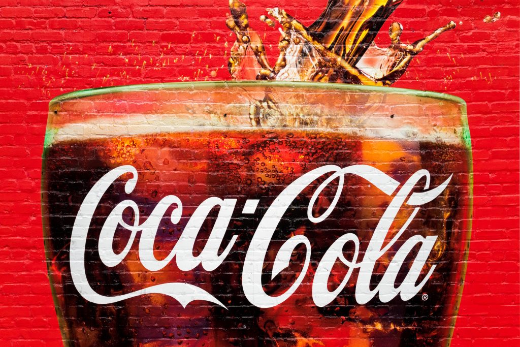
Coca Cola
Coca Cola has identified its ubiquitous beverage with red branding since the 1890s. Originally distributed in barrels, the company needed to avoid any confusion with similar barrels containing highly taxed alcohol. So, they began painting their barrels red, and it has been standing out from the crowd ever since.
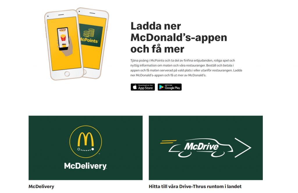
McDonald’s
In India, the McDonald’s website is dominated by red, as the color is considered very auspicious in that country.

However, click on the Swedish McDonald’s site and there’s no red to be seen.
Instead, the site uses green and yellow, colors that locals associate with a healthy, eco-friendly lifestyle.
Orange
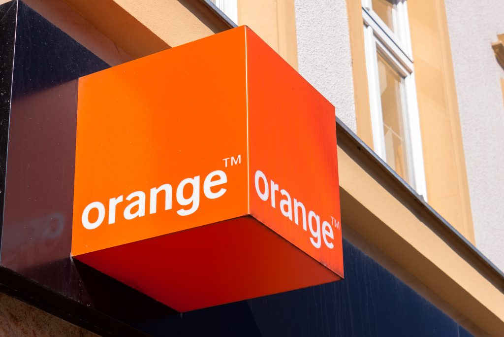
Mobile Phones and Religion
In 1994, when telecom company Orange launched in the UK, its branding and marketing was based around the slogan, ‘The future’s bright…the future’s Orange.’ Meanwhile, in Northern Ireland, where protestant and catholic divisions have been a source of conflict for centuries, orange is the color of the Protestant Loyalist movement.
So, the Telecom company inadvertently found itself taking sides in one of the world’s most enduring conflicts and alienating the country’s large Catholic population. The problem was so great, the company even considered changing its name.
Flesh
Makeup Diversity
When Estee Lauder launched a new foundation called Double Wear Nude Water Fresh Makeup SPF25 in 2018, the concept was to offer the product in a variety of skin-colored shades, so shoppers could choose their perfect match.
Unfortunately, most of the shades were only suitable for women with very pale, light skin. This lack of diversity left women of color feeling that the company considered their skin undesirable.
Crayola, Again
In 1962, Crayola faced criticism for a crayon color named, ‘Flesh’. Anyone with a darker skin tone would not recognize the crayon’s pale shade as flesh-colored, so the company renamed it ‘Peach’.
Pink
Gendered Pens
Much of the world has made progress regarding attitudes to women, but that didn’t stop Bic rolling out its ‘Bic for Her’ range of pink and pale purple pens in 2012.
As there is no correlation between pen purchasing and gender, women in many markets around the world found the concept patronizing and sexist.
Green
The Sacred Color
In China and some Islamic cultures, green is considered a sacred color. According to an article in the Futurist magazine, when a US company attempted to sell chewing gum in China in a green wrapper, it was seen by the public as sacrilegious. The company changed the wrapper to pink and sales immediately increased.
Milliners hoping to sell to China should also be aware that, when a wife is unfaithful to her husband, he is described as ‘getting a green hat.’
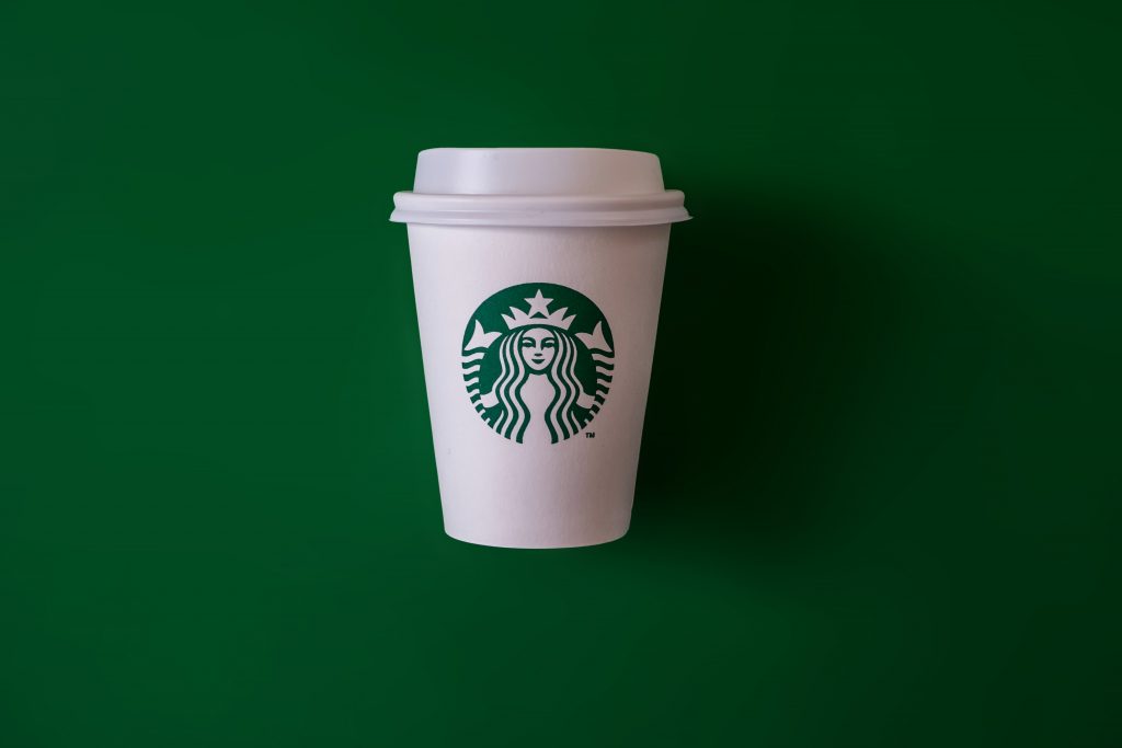
Starbucks
Green is a predominant part of the Starbucks image, who use the color to promote a down-to-earth, relaxed feeling in its cafes. The color scheme is intended to evoke a sense of sanctuary, where busy people can find comfort with a mug of coffee.
Green Means Go
In Japan, people often refer to ‘Go’ traffic lights as being blue, even though it is the same color that the rest of the world call green. Blue and green are similar in hue and, in Japan, green is seen as a shade of blue.
Green Oil?
Oil company BP uses green as an attempt to add an environmental quality to their evolving brand.
Yellow
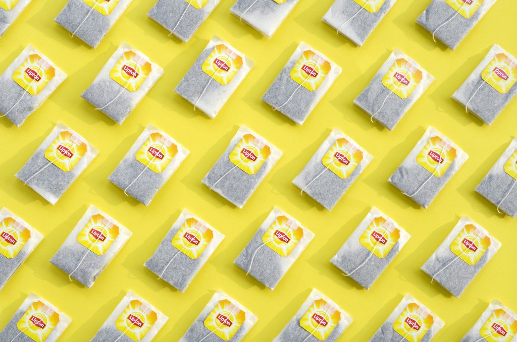
Lipton Tea
The world’s largest tea brand, Lipton, is immediately identifiable in over 110 markets worldwide by its yellow branding.
The company still manages to tailor its visual branding to each region, however, by coordinating the classic yellow with other imagery chosen to reflect the culture and color choices of the nation in question.
Black
Be Careful with Black
The color black is seen as sleek and modern in Japan. So, when a Japanese scooter manufacturer attempted to launch their brand in India, the world’s biggest two-wheeler market, they used a jet black scooter in their advertising campaign.
In India, however, the same color is seen as indicating death. Not surprisingly, the company’s sales were poor. When they realized their cultural blunder, the company promoted the vehicle in different colors, and sales increased.
Localized Colors by Culture
Uber
In the past, Uber used 65 different color palettes to deploy precision-targeted branding in every location in which it operates.
In 2018, design studio Wolff-Olins collaborated with Uber’s internal design team to create branding that would quickly adapt to the 660+ cities worldwide where the ride share company operates.
Uber had two key goals when they created their new brand: simplicity and global usage.
Instead of pursuing an identity system localized through color and pattern, they moved towards a universal ‘beyond-simple’ global brand.
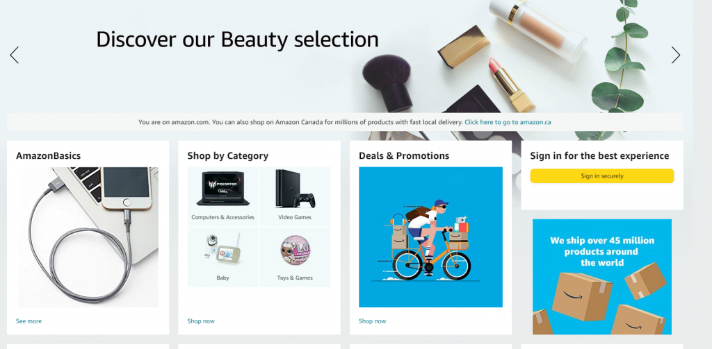
Amazon
Amazon is the largest online marketplace. Each region’s localized website features a home page tailored to their unique local audience. While the products being showcased and, in most cases, the language are localized, so are the colors.
The Amazon US site, for example, uses gray as a backdrop with black and blue highlighted sections and white product panels.
In contrast, the Amazon Japan site is blue-based, with gray and pale colors appearing in limited areas only.
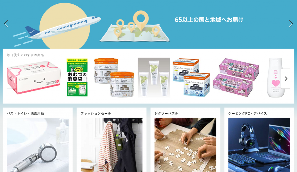
Similar subtle differences are visible in each of Amazon’s regional sites.
Find Your Own Palette
As can be seen from the above examples, understanding how the colors on in your images, website content, and branding will be perceived in local markets around the world is crucial for any company looking to expand globally.
Colors that speak each culture’s language strengthen your global brand.
For localized content that always paints your business in the best possible light, contact Summa Linguae Technologies.


